Most people can get an image that looks fine on the first try. The jump from usable to approval-ready is less about secret words and more about giving the model the same clarity you would give a designer: what it is for, what must stay true, and what “done” looks like.
When the brief is unclear, you get mush: wrong layout, extra text, weird hands, or a slide that looks almost right until you read the numbers. When the brief is tight, you spend less time regenerating and more time shipping.
The habits below line up with how teams get reliable results in real work, and they mirror the patterns OpenAI documents in its GPT image prompting guide. Whether you are in ChatGPT making a deck visual, an ad mock, a diagram, or a product shot, the same idea holds: describe the job clearly enough that another teammate could execute it without follow-up.
What average prompts usually look like
Average prompts are mostly vibe words: “modern,” “clean,” “premium,” “make it pop.” The model guesses. You get something plausible that misses the layout, the text, or the one detail your stakeholder will notice.
Great prompts sound like instructions someone could follow without asking follow-up questions.
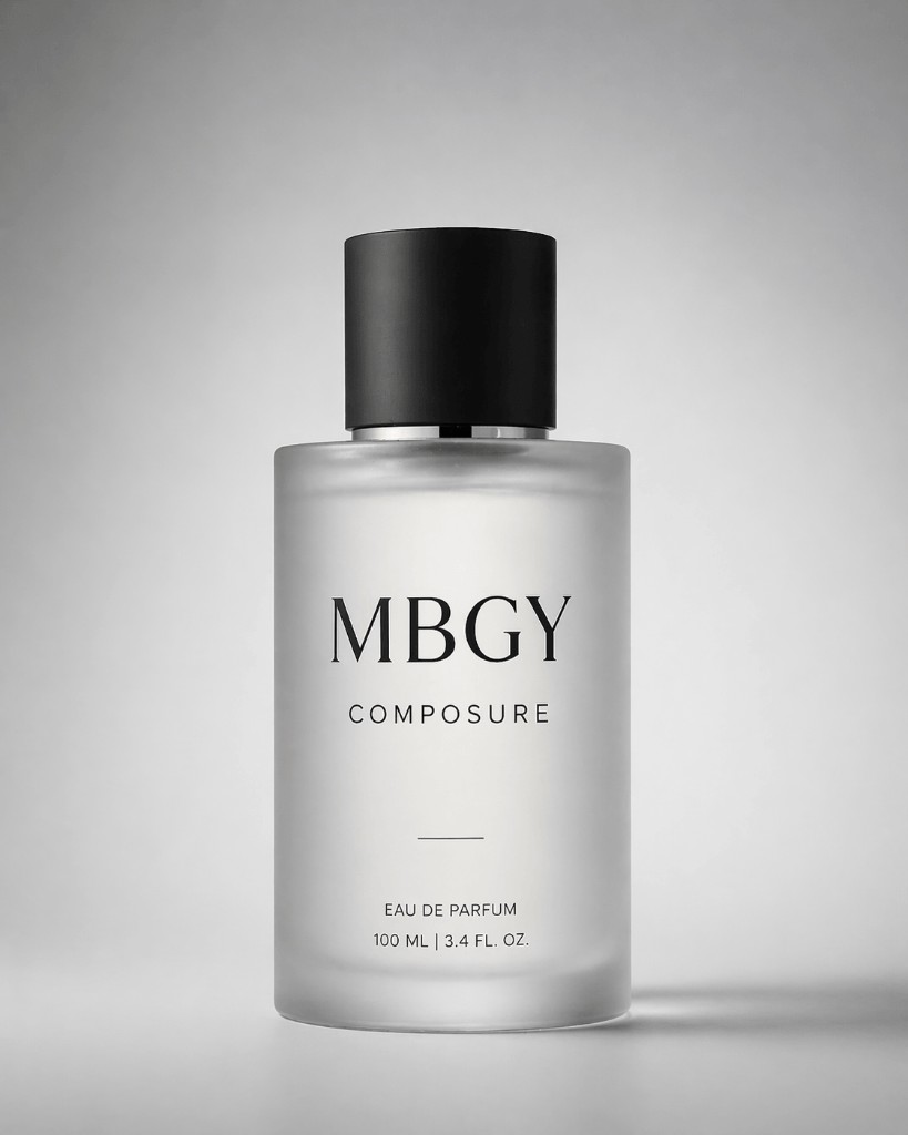
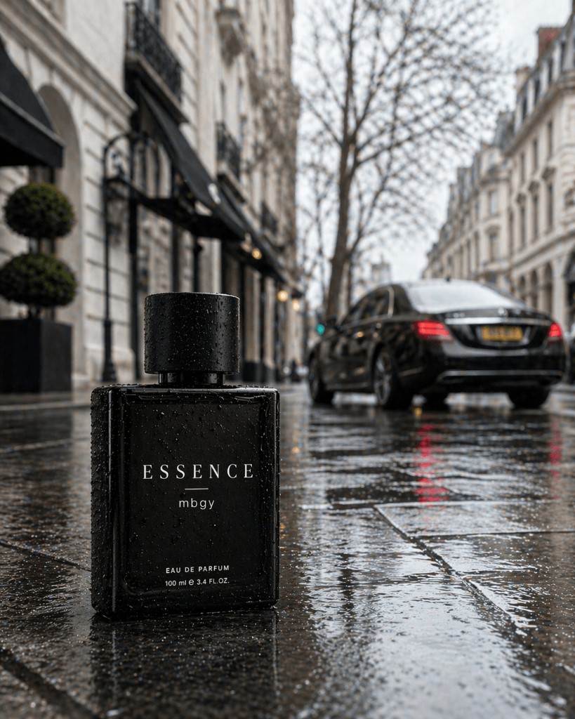
The prompts below are short teaching examples you can adapt. The outcome images are editorial illustrations made for this article (not ChatGPT screen exports). They show the kind of visual gap teams often see when a brief stays vague versus when it names format, layout, and guardrails.
Example: the mood-only brief
Prompt:
Create an image of a cologne bottle on a table.
Example: the same intent with clear jobs
Prompt:
Create an image of a black glass cologne bottle on a rain-soaked city street in the day.

The area is a luxurious, well-to-do part of the city with a blurred luxury vehicle in the background.

Style: cinematic luxury ad look, dramatic lighting, ultra-realistic.

Format: 4:5.
The simple order that lifts quality fast
Try the same order every time. It trains your eye and speeds up teamwork because everyone knows where to look in the prompt.
- Setting: where this lives (office, slide deck, phone screen, plain white backdrop).
- Main subject: the person, product, chart, or hero element.
- Important details: materials, era, props, or the story you need told.
- Hard rules: no watermark, no extra logos, exact headline once, do not change the chart data.
For bigger asks, break the prompt into short blocks with labels (Setting, Style, Text, Do not). Dense paragraphs are harder to fix than short lists.
Name the format early: infographic, one slide, app screen in a phone frame, comic panel, billboard mock. That alone nudges the model toward the right level of polish.
Example: labeled blocks (same slide idea)
When teammates skim the prompt, labels help.
Format: one 16:9 slide layout for an internal update deck, plain white canvas.

Structure: slim top label area with section text "Q3 Operating Focus", no decorative imagery.

Content:
- Headline: "Monthly execution plan"
- Bullet 1: "Reduce lead response time from 6 hours to under 2 hours"
- Bullet 2: "Automate weekly status reporting for sales and operations"
- Bullet 3: "Launch client onboarding checklist to cut setup delays by 30%"
- Chart: minimal horizontal bar chart titled "Progress vs target" with three bars:
  - Response time improvement: 65%
  - Reporting automation rollout: 40%
  - Onboarding checklist completion: 55%

Visual style: dark charcoal text, muted navy and gray accents, modern sans-serif, generous spacing, clear hierarchy.

Constraints: no logos, no watermarks, no photos, no extra slogans, no second headline.
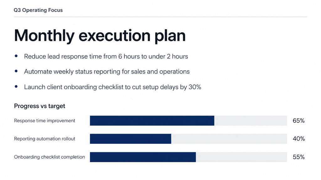
That lines up with the tighter slide outcome above. Labels are training wheels. The habit underneath is still setting, subject, details, and hard rules.
Say what it should look like, not only what it should feel like
Say whether you want a photo, a flat illustration, a watercolor look, a 3D render, or a photo of a printed card on a desk. “Nice” is not a format.
If you want a real-photo feel, say so in plain words: “photorealistic,” “candid photo,” “taken on a phone in daylight.” Add a little texture the eye expects: worn fabric, real skin texture, dust on a shelf. If you say “premium,” add what that means for you: soft light, minimal retouching, no glam lighting.
If you want a stylized look, pick two or three style anchors (color family, line weight, grain). Long lists of adjectives usually fight each other.
Give the camera a job
Average images ignore the camera. Better ones name it, simply:
- Distance: wide shot, medium, close-up, overhead.
- Angle: eye level, from slightly above, low angle.
- Light: soft window light, golden hour, bright office fluorescents, neon at night.
- Layout: “headline in the top third,” “logo top-right,” “leave empty space on the left for text later.”
For rainy streets, neon, or big mood scenes, add a line about space and weather (how hard it is raining, how far you can see down the block). Mood-only prompts often trade away fine detail.
One line that folds camera and layout together:
Medium wide shot at eye level, soft window light, headline in the top third, chart in the lower half, leave empty space on the right for a callout later.
People: say what you would notice in a real photo
If there are people in the shot, say it like you are directing a friend with a camera:
- “Full body, feet in frame.”
- “Looking at the laptop, not at the camera.”
- “Hands on the mug, fingers relaxed.”
That is how you cut down on floating hands, stretched limbs, and eyes that do not line up.
Words in the picture need the same care as words in a doc
The model can put text in an image, but it needs rules, not vibes.
- Put the exact line in quotes if it must read perfectly.
- Say where it sits (top banner, bottom band, centered on the package).
- Say the style in everyday terms: “bold sans-serif,” “small caption under the chart,” “high contrast so it reads on a phone.”
- For awkward spellings, spell them out slowly in the prompt if the label has to be perfect.
Example: text with hard rules
Prompt:
Create a straight-on product photo of a glass jar on a plain light gray studio background.

Label text exactly, verbatim, in bold black sans-serif:
"SAMPLE ROWAN HONEY"
Smaller subtitle centered under it: "Wildflower blend"

High contrast label on cream paper texture. No other words on the jar.

Do not: real trademarks, QR codes, or nutritional panels.
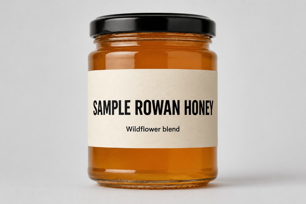
Ask for no extra words, no doubled headline, and one clean version of the tagline when that matters.
If you are packing a slide with small type, start simple. Get the layout and hierarchy right first, then ask for denser text in a second step. If your team later plugs the same habits into software with image APIs, you can often push fidelity further there. In ChatGPT, patience and two-step prompts beat one overloaded wall of text.
Edits: change one thing, protect everything else
This is where average turns into a mess. People ask for ten edits at once, then wonder why the logo moved.
Better pattern:
- “Change only the time of day to dusk. Keep people, framing, and colors the same.”
- “Translate the words on the image to Spanish. Do not change layout, icons, or photos.”
If the picture starts to drift, paste your “do not change” list again on the next message. Do not assume the thread is perfect memory.
If you are combining more than one reference image, label them: “Image 1 is the room. Image 2 is the product. Put the product on the table in Image 1 and match the shadows.”
Example: one change versus a pile of changes
Batch edit (hard to ship clean):
Make it warmer, crop tighter, fix the text, translate to Spanish, swap the icon set, and add a footer.
Surgical edit:
Change only the headline color to navy. Keep layout, chart data, and all other text the same.
Reliable iteration: one fix per message
Your first prompt can be long. After that, one adjustment at a time is the fastest way to great: “Warm the light.” “Remove the extra chair.” “Fix the third bullet only.”
If something critical slips (a number, a name, a price), say the correct version again instead of hinting.
Where output gets less predictable
Huge, ultra-detailed outputs can get less predictable. If the image is going on a big screen or print, plan a quick human check before it goes external.
If you need speed over perfection, fewer ideas per image usually beats one jam-packed scene.
Pocket cheatsheet (save or share)
- Order: setting, subject, details, rules, plus what you are making (slide, ad, diagram).
- Look: photo vs drawing vs UI. Say it outright.
- Camera: distance, angle, light, where things sit on the canvas.
- People: feet in frame, gaze, hands, scale.
- Text: exact words in quotes, placement, “no extra text.”
- Edits: one change, repeat what must stay the same if things drift.
- Several images: label each file and say what moves where.
- Steps: one fix per message after the first generation.
AI images are not a free pass on brand or legal review. Do not ask for logos or marks you do not own. Check numbers and claims before anything customer-facing goes live, and keep a human sign-off on public assets.
Who gets the most from this
Operations and marketing teams feel this first: anyone who lives in slides, training visuals, social mocks, or product collateral and wants fewer “almost” rounds before approval.
If you later bake image generation into an internal tool or customer-facing product, these same briefs become your templates and guardrails. The writing habits do not change. Only the plumbing around them does.